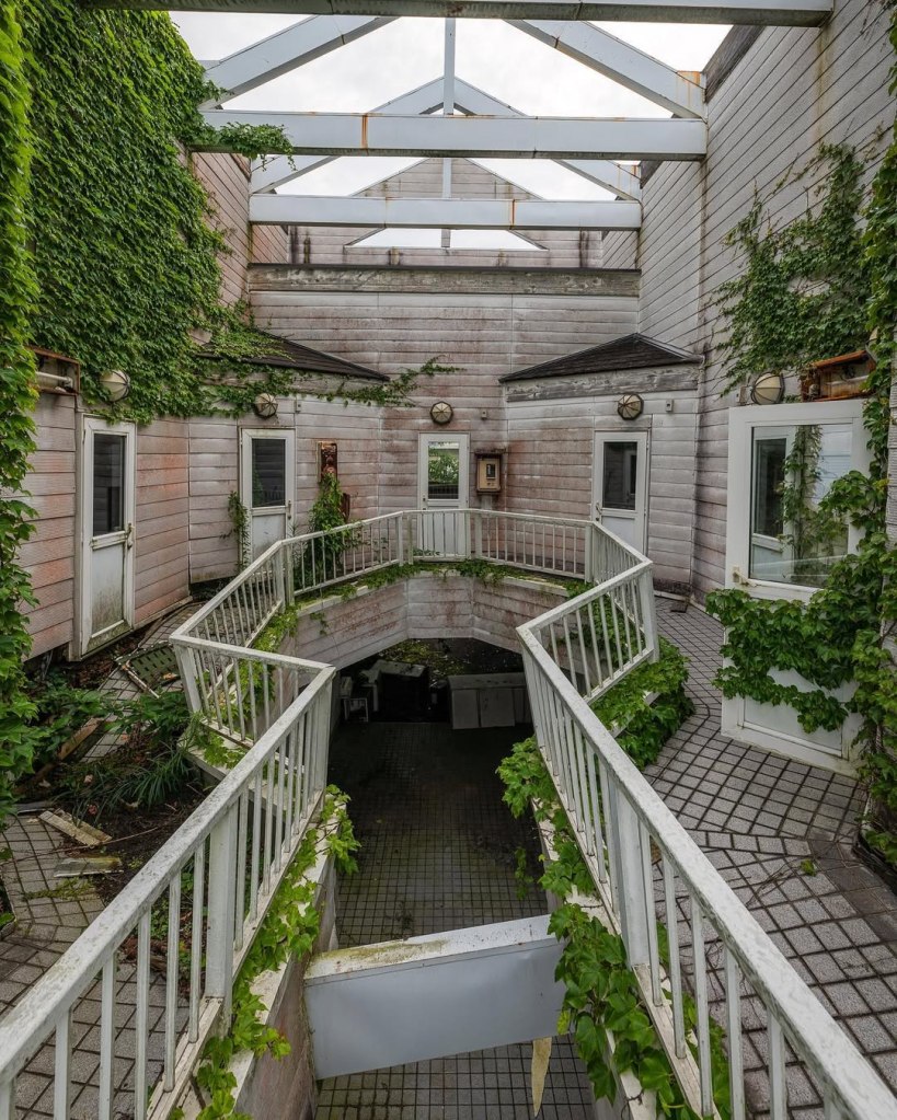
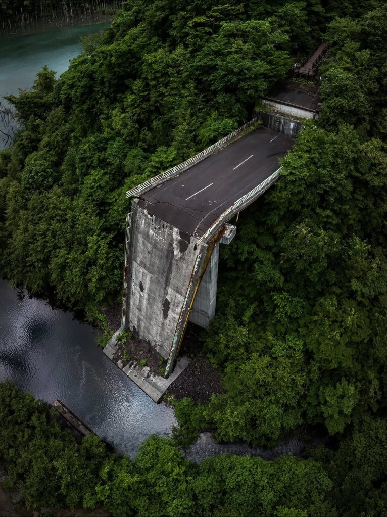
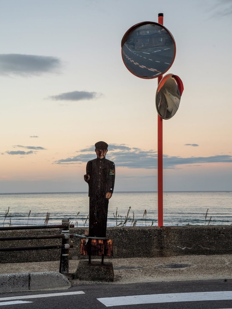
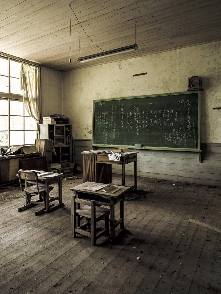
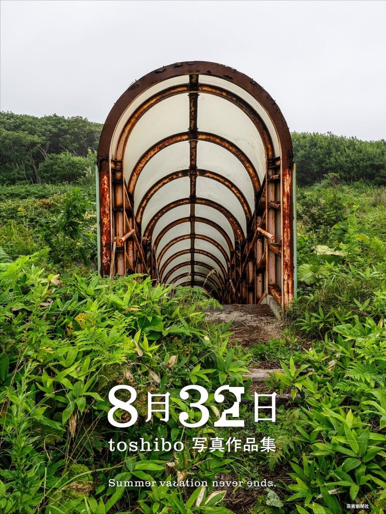
A few days ago, I happened to see a book titled August 32, created by Toshibo. The title itself carries a certain symbolic meaning. The date “August 32” obviously does not exist, giving a sense of time being shifted and memory being distorted. It also reflects Toshibo’s exploration of the space between reality and unreality.
His whole work is filled with a dreamy atmosphere. Toshibo uses a lot of natural light, but it is not the bright light we often see in midsummer. Instead, it feels soft and blurred, as if time has paused, floating within memory. While reading it, I experienced a strange sense of displacement. Even though I did not grow up in Japan, I could still feel a connection with the objects and buildings weathered by time.
There are no people in the images, but we can sense traces of past human life through broken bridges, buildings covered by plants, and rusted gates. These scenes together create landscapes after humanity, giving narrative depth to otherwise still spaces. The text and layout in the book are also carefully designed, making the work not just a collection of images but easier and more enjoyable to read.
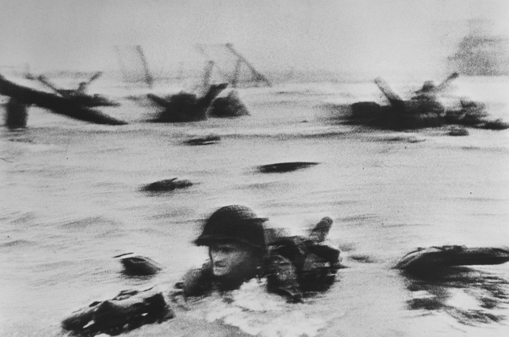
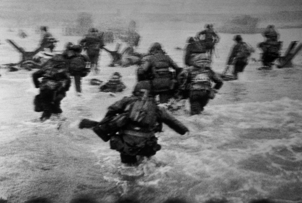
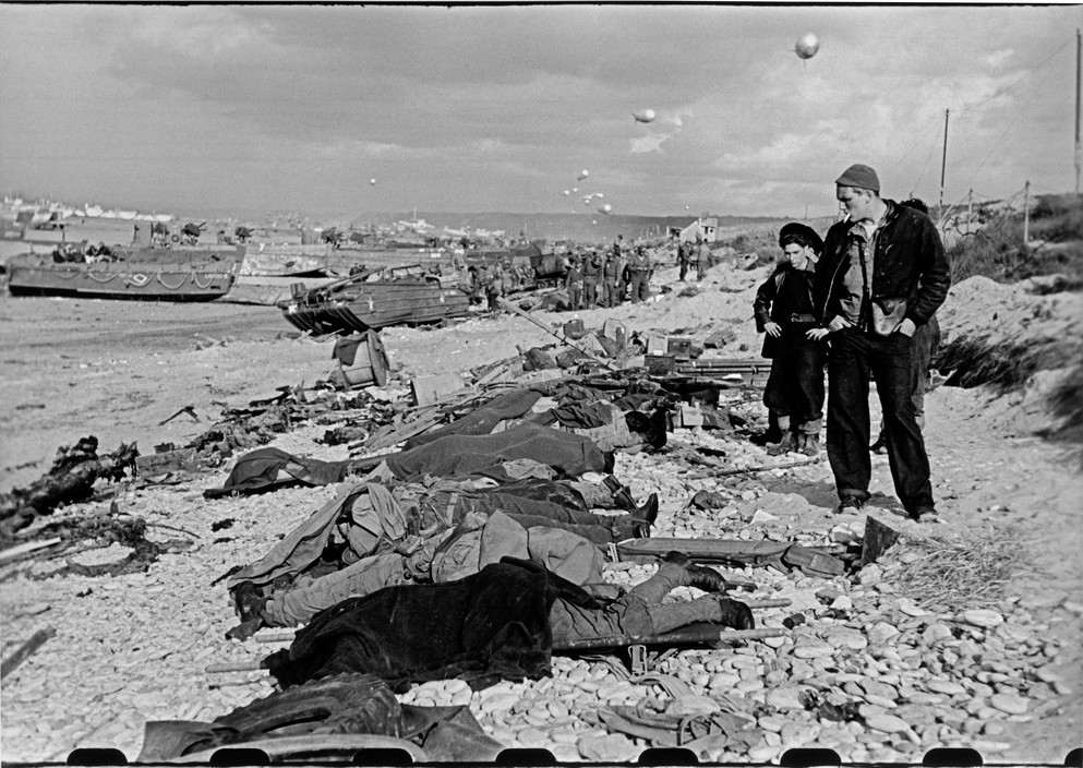
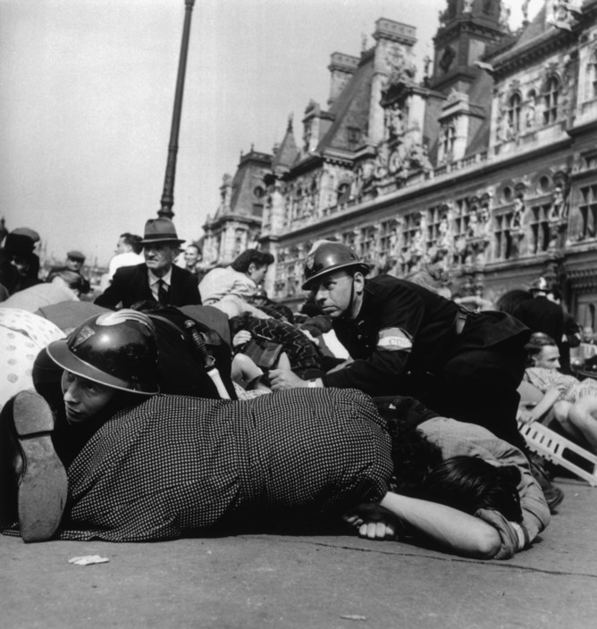
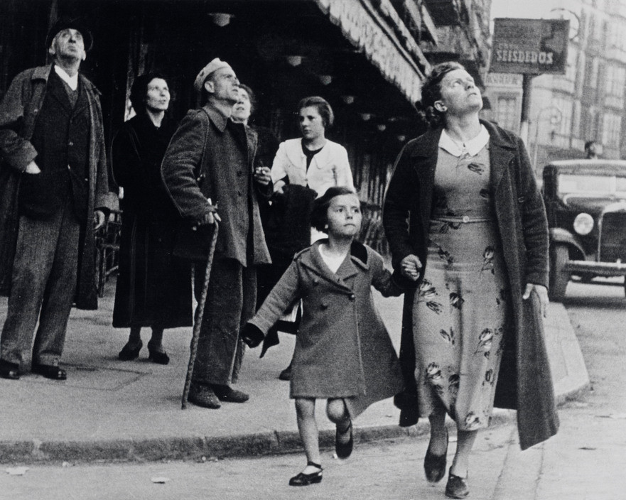
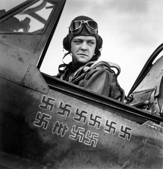
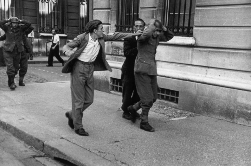
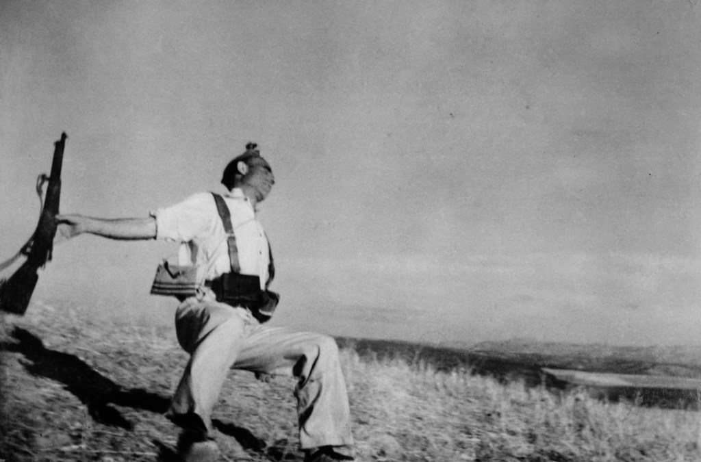
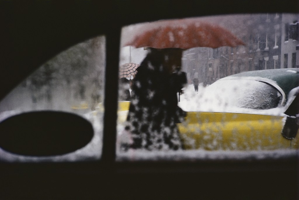
A few weeks ago, I went to the Yokohama Art Museum to see an exhibition of Robert Capa’s works. The title of the exhibition was 平和であることへの、控えめななにごとかを, which translates to “A Modest Gesture Toward Peace.” I think it is quite timely to revisit these kinds of works considering what is happening in the world right now.
Robert Capa was a Hungarian American war photographer and photojournalist. Even though he passed away young at the age of 40 after stepping on a landmine, he is still considered one of the greatest war photographers of all time.
I am going to skip the usual biographical details since there are already plenty of good articles out there. What I want to share instead are some of my personal thoughts on his work. To me, a great war photographer documents the moment truthfully, without beautification or staging, yet still manages to evoke deep thoughts and emotions from the audience.
I have never been particularly drawn to war photography or even history in general, partly because I was taught to always stay critical and history can often be written from a certain perspective. But seeing his works from the Spanish Civil War and World War II changed that. Those moments, such as soldiers waiting on the beaches or pilots preparing to take off, feel completely different from street photography, where you know the subjects will likely go on with their lives after the photo is taken. In Capa’s photos, you can almost sense that many of those young faces might not have survived the battle. Even without knowing their names, you can feel the weight of their fate.
Capa’s photos were always taken close to his subjects. His most famous phrase, “If your pictures aren’t good enough, you’re not close enough,” perfectly captures his philosophy. His use of light and composition always served the story and its tension. He did not chase perfect symmetry or aesthetic balance. Instead, he let the chaos, movement, and conflict within the scene speak for themselves.
Seeing his work in person renewed my thoughts about the whole field of war photography. I have always been anti war, and I believe exhibitions like this are crucial reminders of what war really means: the loss of lives, memories, and futures, all because of power or hatred.
中文版本:
几周前,去了趟横滨美术馆,看了一个让我印象很深的摄影展,罗伯特·卡帕(Robert Capa)和其他艺术家们相关战争的摄影作品展。标题是「平和であることへの、控えめななにごとかを」,意思为 A Modest Gesture Toward Peace(为和平而作的温柔姿态)。我觉得在现在这个时间点看到这样主题的展览还是挺有趣的。
Capa有一句名言“如果你的照片不够好,那是因为你离得不够近”(If your pictures aren’t good enough, you’re not close enough)。我认为非常准确地总结出了他的摄影哲学。Capa总是贴近被摄者,贴近危险,当然也更贴近真实。他的光影和构图几乎不会追求完美的对称或形式上的美感,而是让画面中的冲突、动作与情绪自然地讲述故事。
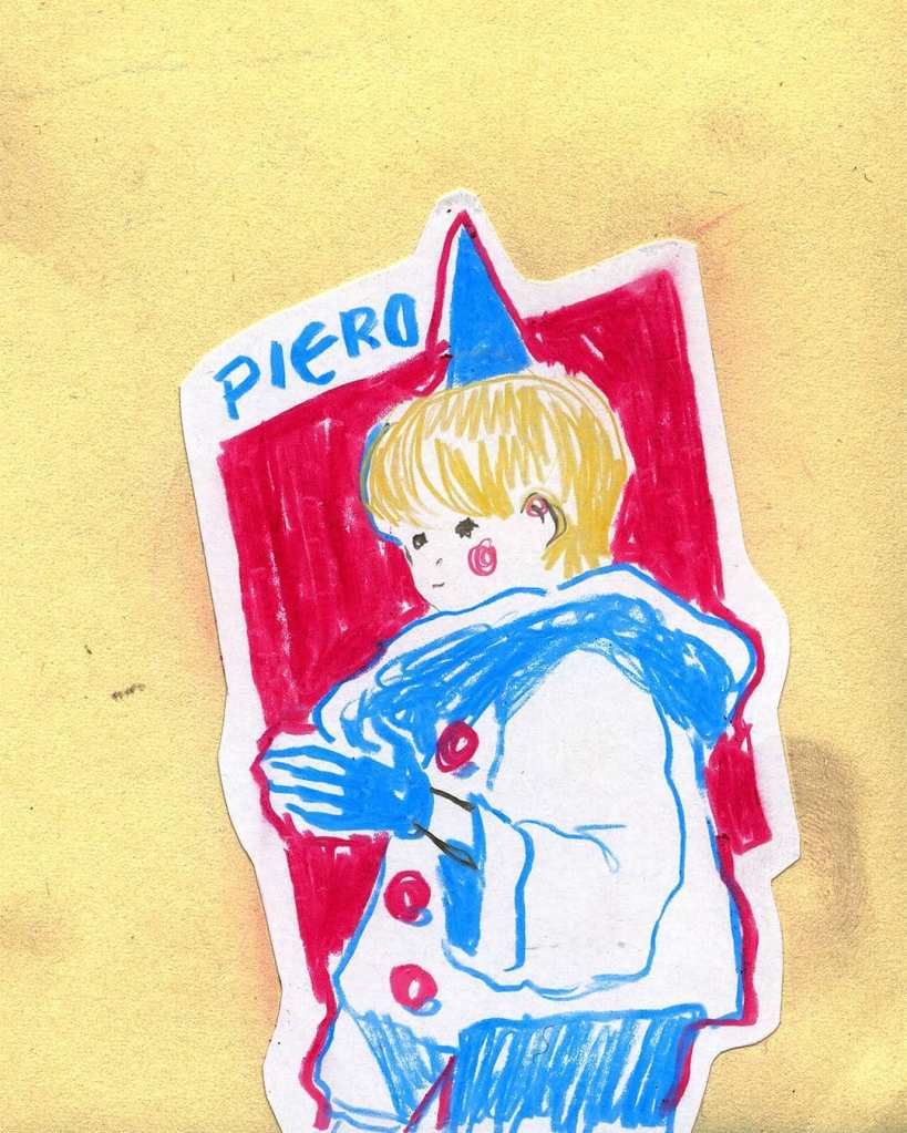
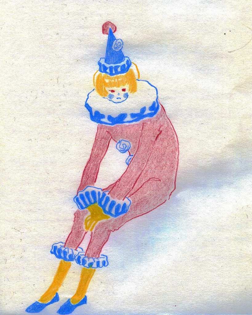
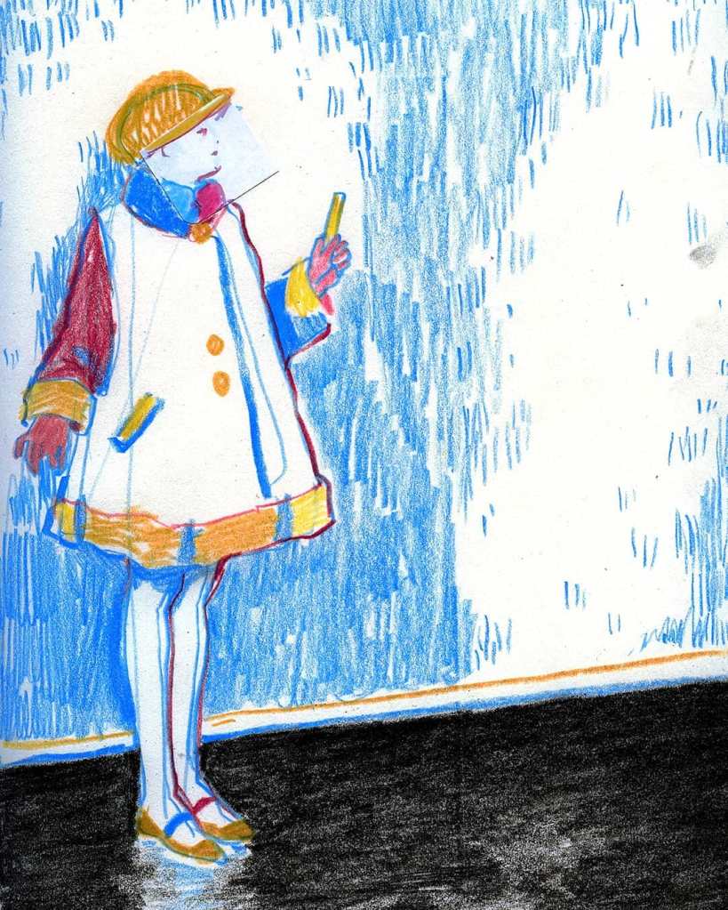
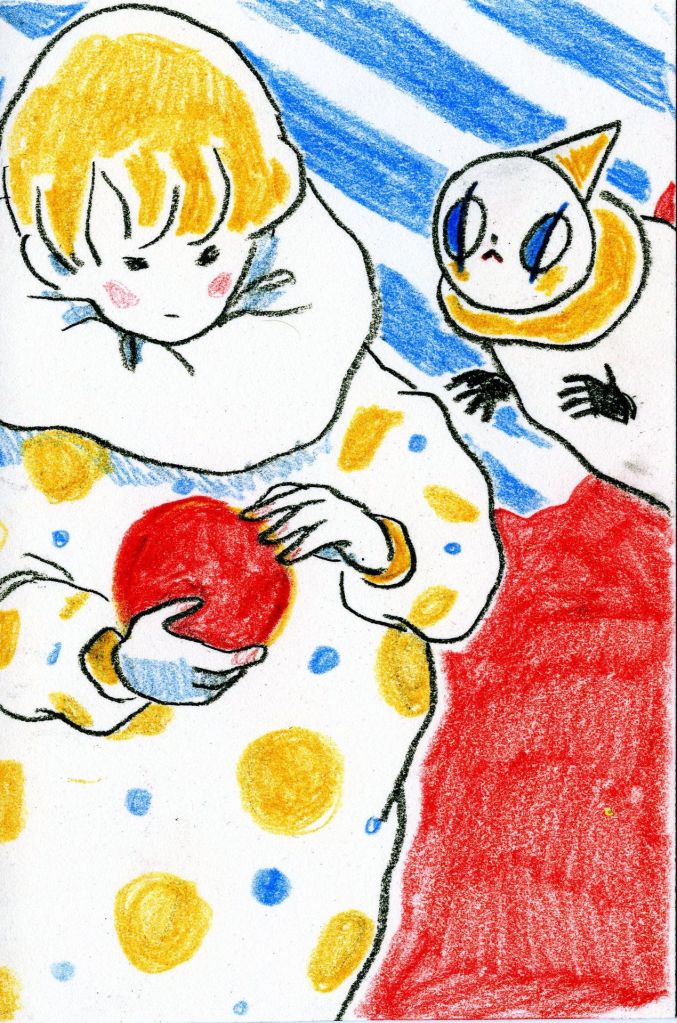
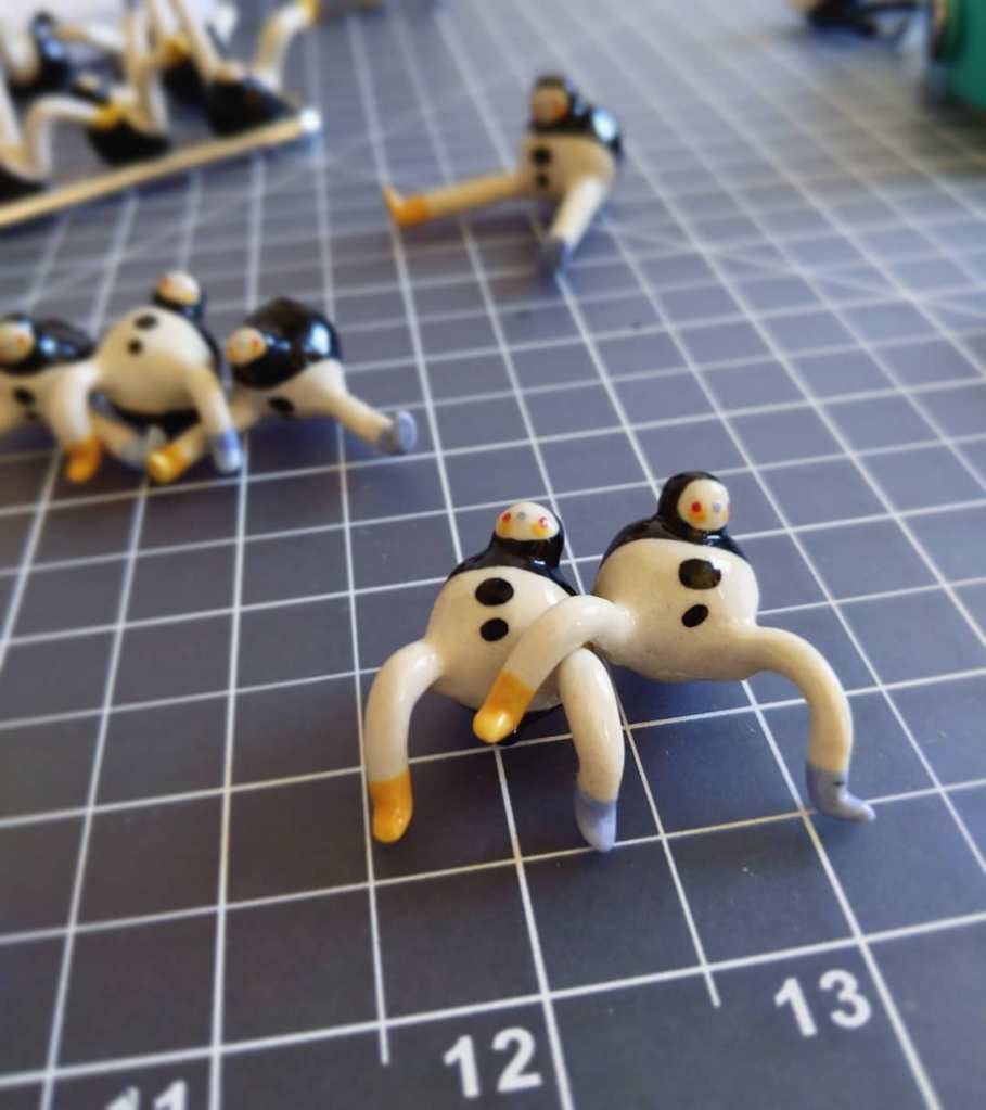
AK Kidd, who works under the cover name GoatPierrot, is a freelance artist I first came across on Instagram. He graduated with a BFA from the School of the Art Institute of Chicago in 2019 and is currently based in Glasgow, Scotland. While he also paints, much of his practice is centered on ceramics.
The piece below is a good example of his style. His palette often draws from the primary colors — red, yellow, and blue. Combined with simple lines and bold color blocks, his ceramic works create an intriguing tension, as if minimalism and maximalism are colliding in the same object. The result feels both playful and intense, leaving a lasting impression.
I believe the toy-like figurines he designed are among his most iconic creations. They could even be mass produced, which not only makes them recognizable as artworks but also turns them into objects that could bring in some extra income.
At the end, I’ll share a few images of his work so readers can get a better sense of his style.
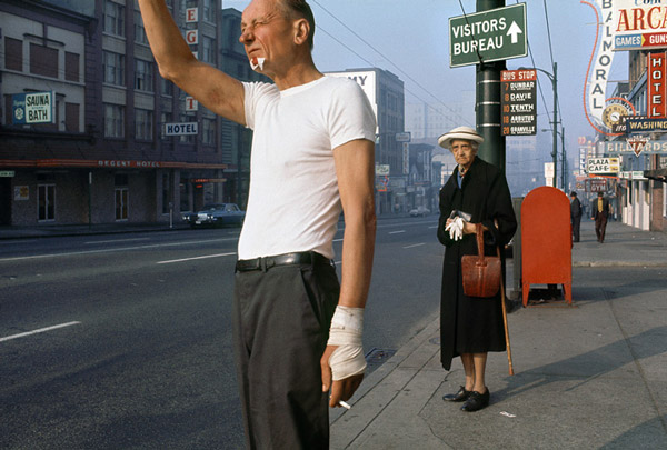
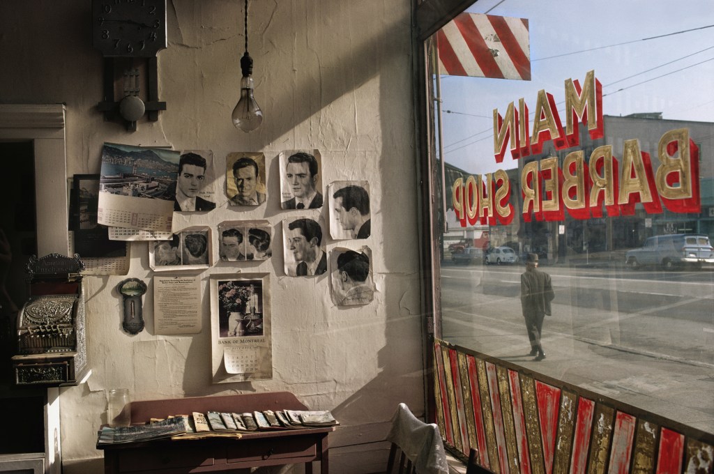
Fred Herzog is an artist I’ve known about for quite a long time, but I never really dug deep into his work. While doing research for a street photography project the other day, I came across his book Modern Color in the library and realized it’s an incredible resource for studying color composition. I ended up buying the book myself because I found it to be an epic when it comes to color street photography.
More recently, I saw one of his images featured on an Instagram account, which inspired me to do a more personal research into his work. What I found is that his photographs have a certain kind of magic — a balance between color and composition that feels effortless.
For instance, in one of his images, the composition on its own isn’t particularly strong. But once color comes into play, the whole frame feels balanced — striking a harmony between minimalism and complexity.
What fascinates me most is how his compositions often break the “rules.” Normally, we would avoid things like a cropped head or a distracting element. But Herzog somehow makes it work — he draws our eyes to unexpected details, like a warped hand, an old lady in shabby clothes, or a red newspaper box in the background. These “imperfections” become the very things that make the image alive and memorable.
中文版本:
Fred Herzog 这位摄影师很早就有所耳闻,,但一直没有真正系统化的了解过他的作品。前段时间在做Street Photography的研究时,在图书馆偶然翻到他的作品《Modern Color》,才意识到这本书在色彩及构图上的水准有多高。以至于后来我自己也买了一本放在家里,可以时不时欣赏1960s-50s街景的同时获取灵感。个人觉得这本书完全可以称得上是彩色街头摄影的经典。
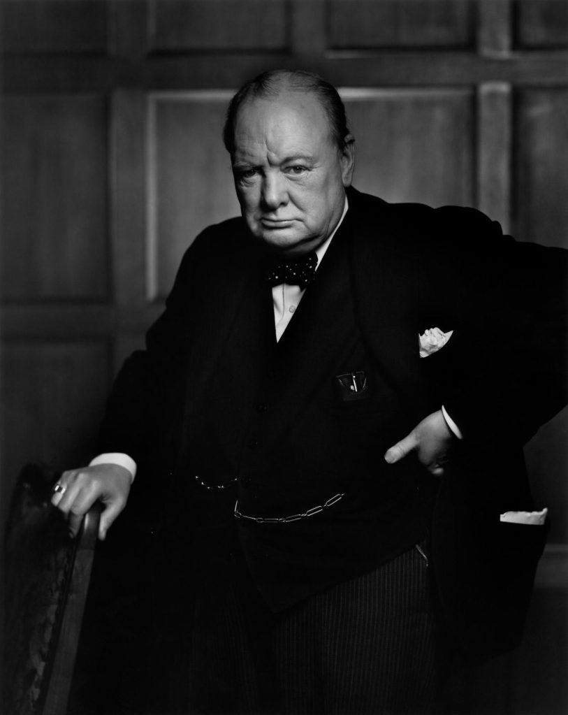
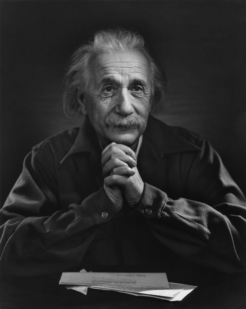
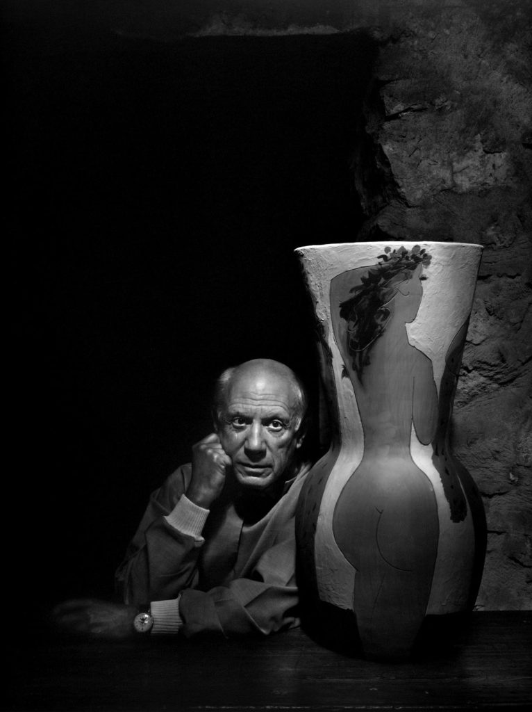
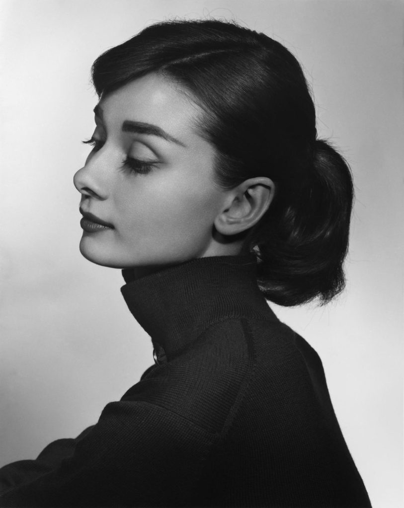
Yousuf Karsh is a legendary photographer of the 20th century. More than twenty of his portraits appeared on the cover of Life magazine — an extraordinary honor for any photographer. Since I’ve been starting to practice professional studio portraits, I find his work especially inspiring.
The most iconic is, of course, his portrait of British Prime Minister Winston Churchill. What makes Karsh so unique is not only the timing or posing, but also the way he captured personality with extraordinary clarity. He had an incredible ability to direct his sitters, sometimes even disarming them in unexpected ways, so their authentic expressions emerged.
Technically, his approach was classic but powerful. He often used dramatic lighting to sculpt the face, separating the subject from the background while emphasizing texture and depth. His compositions were straightforward, yet his control of light and presence made the results unforgettable.
The result was portraits that feel both timeless and larger than life. Even with such traditional techniques, his work stands apart, reminding me that great portraiture is less about inventing something new, and more about mastering the tools to reveal the truth of a person.
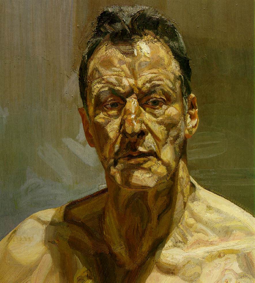
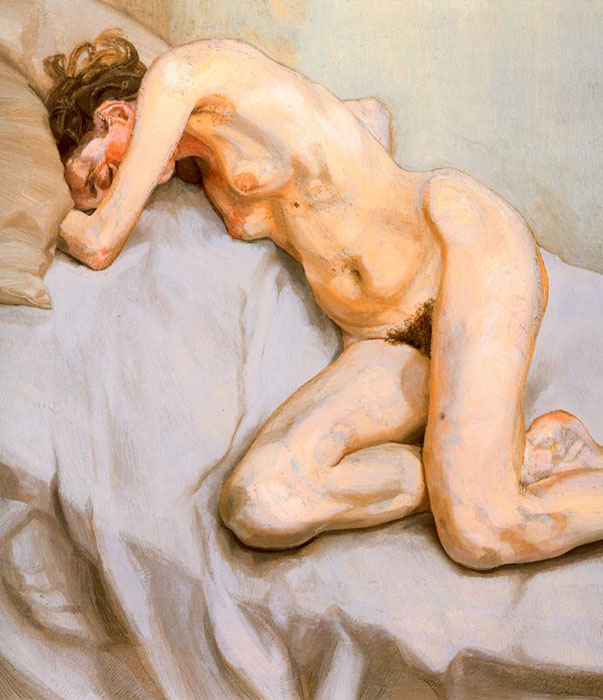
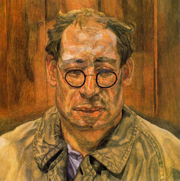
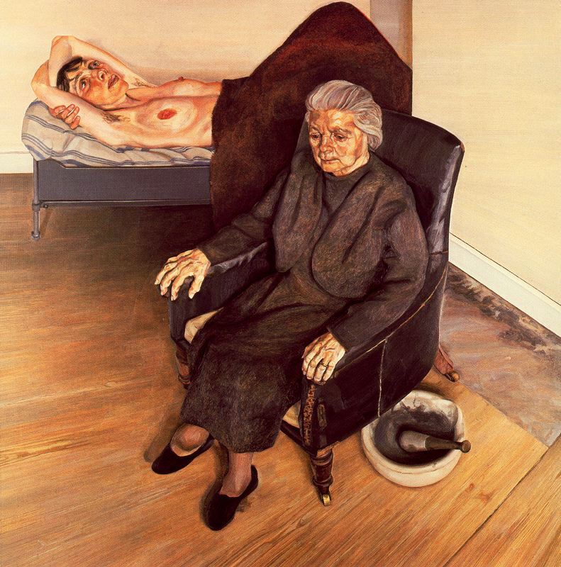
This week, I’ll talk about my weekly favorite artist, Lucian Freud. Freud is best known for his unique, realistic treatment of nudes and his intense, often unflinching portraits. Since I’ve been shooting portraits a lot lately, I found his works have a certain quality—abstract yet deeply realistic at the same time.
I used to focus on environmental portraits, believing that the surroundings help convey the subject’s character. But after studying Freud’s work, I’ve started to think more about close-up portraits. His paintings strip away context and bring you face-to-face with the subject, letting every wrinkle, line, and subtle shift in expression tell the story.
In portrait photography, this approach shifts the emphasis from “who the person is in their world” to “who the person is in themselves.” Just as Freud embraced raw texture, natural imperfections, and unfiltered presence, a photographer can use lighting, framing, and depth to reveal the subject’s truth. It’s not about perfection—it’s about presence. And that, in many ways, is the very heart of portraiture.
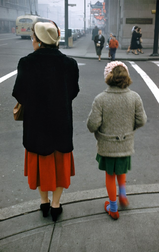
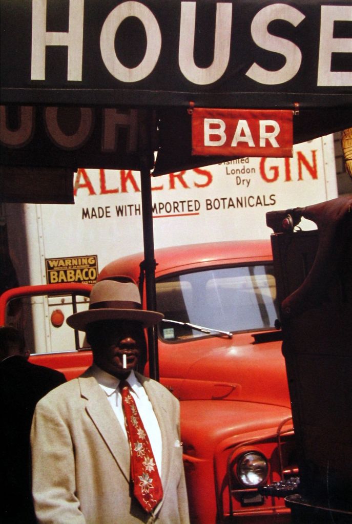
Saul Leiter was an American artist and one of the early pioneers of color photography. He moved to New York City at the age of 23, where he became friends with Abstract Expressionist painter Richard Pousette-Dart, who was also experimenting with photography at the time.
As someone who loves Impressionism, I find Leiter’s work incredibly painterly. His use of color feels soft, emotional, and almost brush-like. I’m especially drawn to his winter photographs. As someone who often struggles with shooting in the low-light conditions of winter, his images offer a kind of quiet inspiration. Somehow, even in the grey and muted months, his images remain vibrant and full of feeling.
One thing that stands out to me is the way he composes his shots. There’s often a large amount of negative space, but instead of making the frame feel empty, it only makes the color details more striking. The sense of quiet and stillness gives each image a strong emotional presence.
Looking at his work makes me want to reconsider how I approach composition. I tend to fall back on more traditional framing methods, like the golden ratio, but Leiter’s work reminds me that breaking away from the usual rules — and embracing space, light, and mood — can lead to something even more powerful.
中文版本:
Saul Leiter 是一位美国艺术家,也是彩色摄影的早期先锋之一。他 23 岁时搬到纽约,并在那里结识了抽象表现主义画家 Richard Pousette-Dart。当时 Dart 也正在尝试摄影创作。
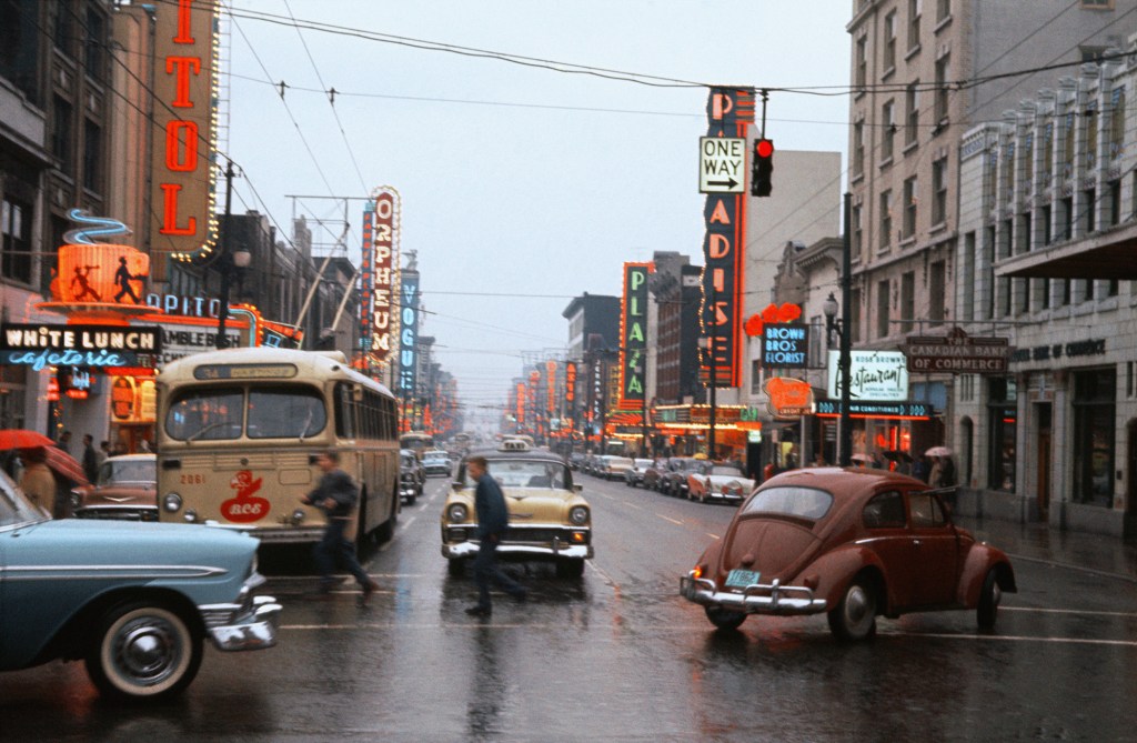
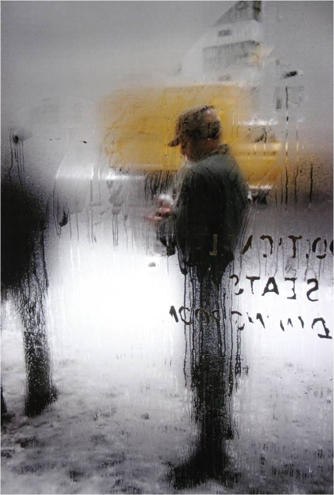
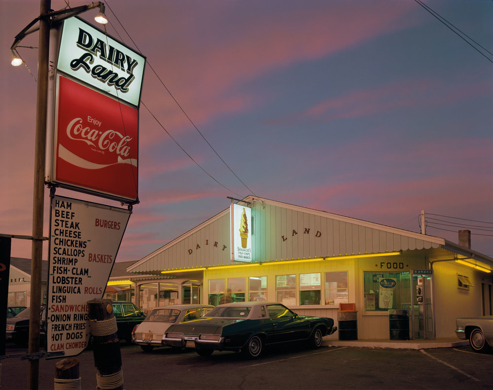
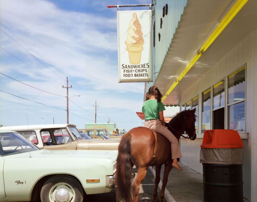
Joel Meyerowitz is one of the photographers who has inspired me for a very long time. I’m especially drawn to his series Cape Light. There’s no need to mention his iconic 35mm color street photography — it’s legendary on its own. Honestly, each of his series deserves its own post, but for now, I just want to share a few impressions of this remarkable photographer.
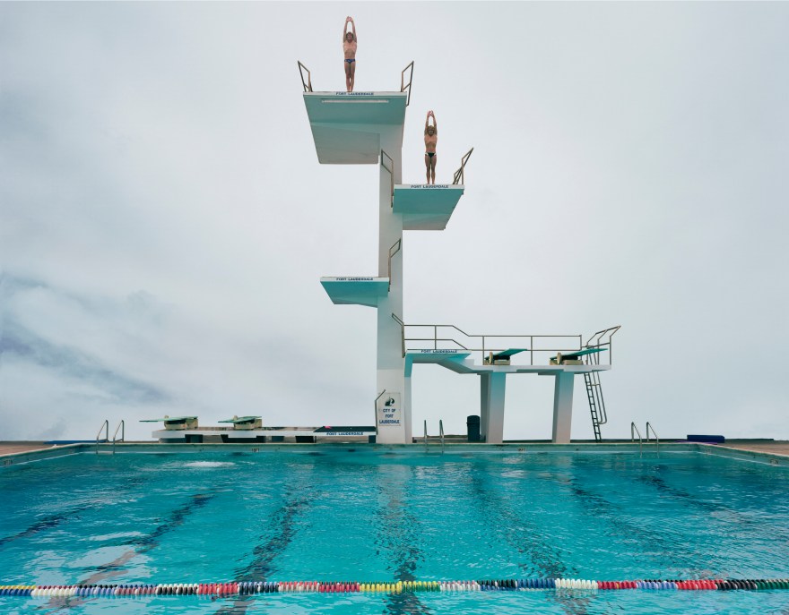
What stands out to me is the simplicity and thoughtfulness of his compositions. In his swimming pool series, for example, many of the pools are set right by the bay. This subtle placement invites viewers to think about the contrast between the artificial and the natural — the geometric stillness of a man-made pool versus the expansive, organic movement of the sea. It’s a quiet but powerful kind of tension.
Technically, Meyerowitz’s approach is just as considered. He often uses a small aperture to ensure both the foreground and background are in crisp focus. This gives his images a clarity that feels almost painterly — not staged, but deeply intentional.
In his street photography, take for example the image of a red vintage car parked in front of a house with matching red window frames. The symmetry in composition and the way the colors echo each other is stunning. These kinds of aesthetic decisions — formal, but not rigid — are inspiring no matter what subject matter you’re photographing. It’s the kind of visual sensitivity I think every photographer can learn from.
Returning to the pool series: what resonates with me most are the cool, unsaturated blue tones. There’s a calmness to them — a kind of quiet detachment from reality — that makes the scenes feel timeless, like they’re suspended in some in-between place. I’m hoping to bring a similar mood into my own work. Not by imitation, but by learning to pay attention to color and light the way he does — subtly, and with intention.
中文版本:
Joel Meyerowitz 是一个长期以来都给我很多灵感的摄影师。他的《Cape Light》系列让我特别着迷。当然,他那组经典的 35mm 彩色街头摄影几乎无需赘述,已经成为了标志性作品。其实他的每一个系列都值得单独写一篇文章来细聊,但这次,我只是想简单记录一下对这位杰出摄影师的一些印象和想法。
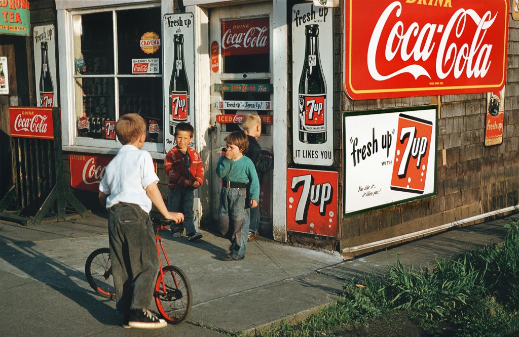
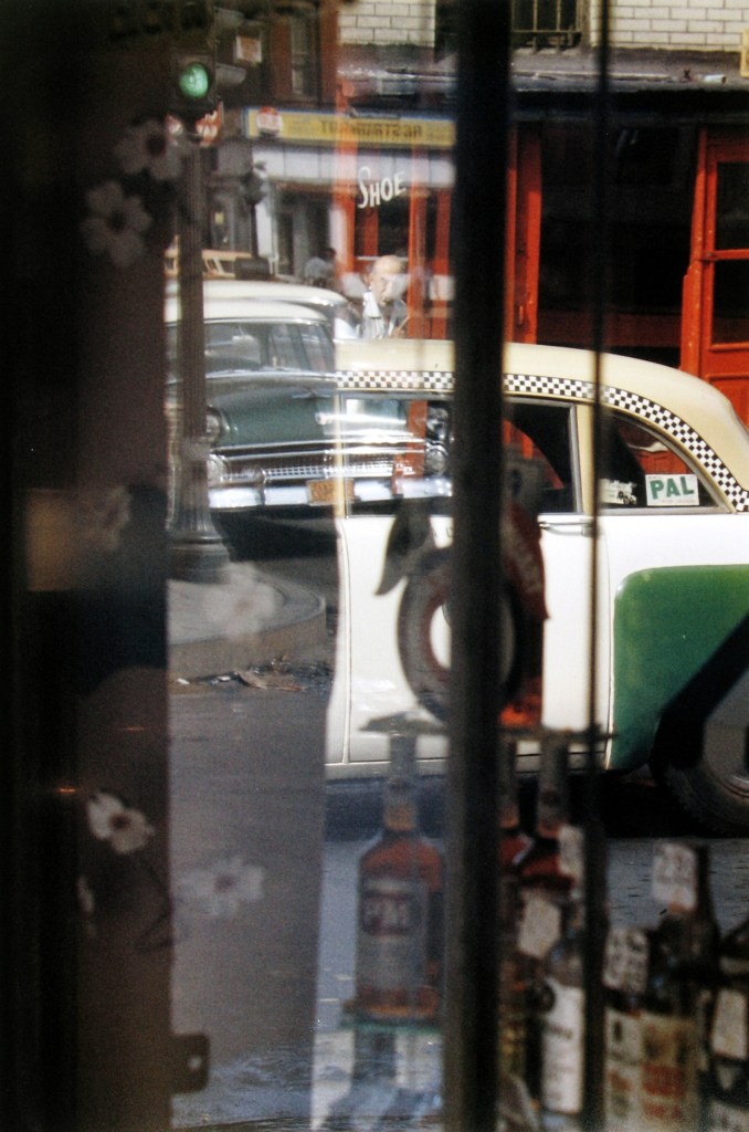
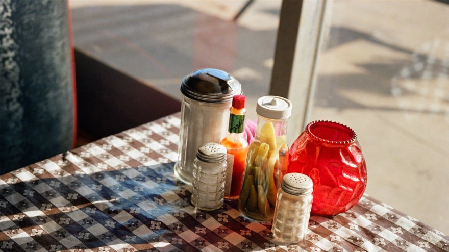
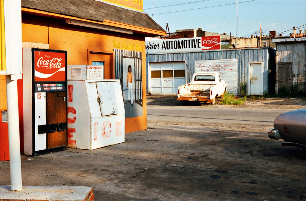
This is actually the second time I’m writing about William Eggleston—but this time, it feels more personal. As I work on one of my current projects using color film to photograph everyday scenes, I’ve found myself returning to his work with a different level of attention. The more I look at his images, the more I realize how much he has influenced the way I see.
Eggleston is known as a pioneer of color photography, and what fascinates me now isn’t just that he used color, but how he used it. His scenes are often incredibly ordinary—gas stations, corners of a room, plastic bottles on a table—but the way he captures color and light makes them feel strangely important. His use of color is never loud or obvious, but it’s deliberate. There’s a quiet intensity in how one tone plays off another. That subtlety is something I’m thinking about a lot in my own work.
His compositions are classic and restrained. Many of his photos look like snapshots—unplanned, even casual—but they hold a kind of natural balance that feels instinctual. That sense of effortlessness is what I’m starting to appreciate more. It reminds me that simplicity doesn’t mean lack of thought—often, it means just the opposite.
For this project, I’m also working with color film and focusing on things that are familiar or easily overlooked. Eggleston’s work encourages me to slow down, trust the quietness in an image, and pay more attention to how color alone can carry emotion. His influence isn’t about copying his style, but about learning to see more clearly—especially in the most ordinary moments.
中文版本:
这是我第二次写关于 William Eggleston 的内容,但这次会更贴近我个人的视角。最近我在做一个以彩色胶片拍摄日常场景的项目,在这个过程中,我又重新翻看了他的作品。越看越能体会到,他对我观察方式的影响其实一直都在,只是现在更清晰了。
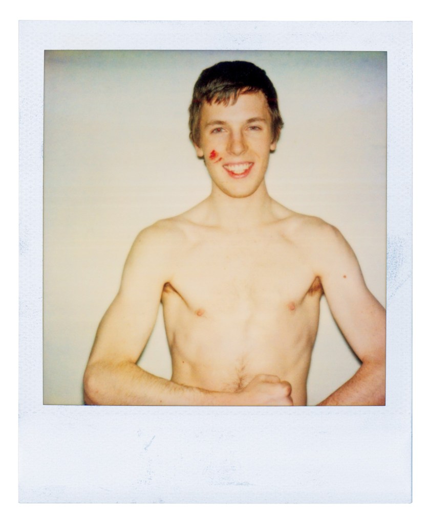
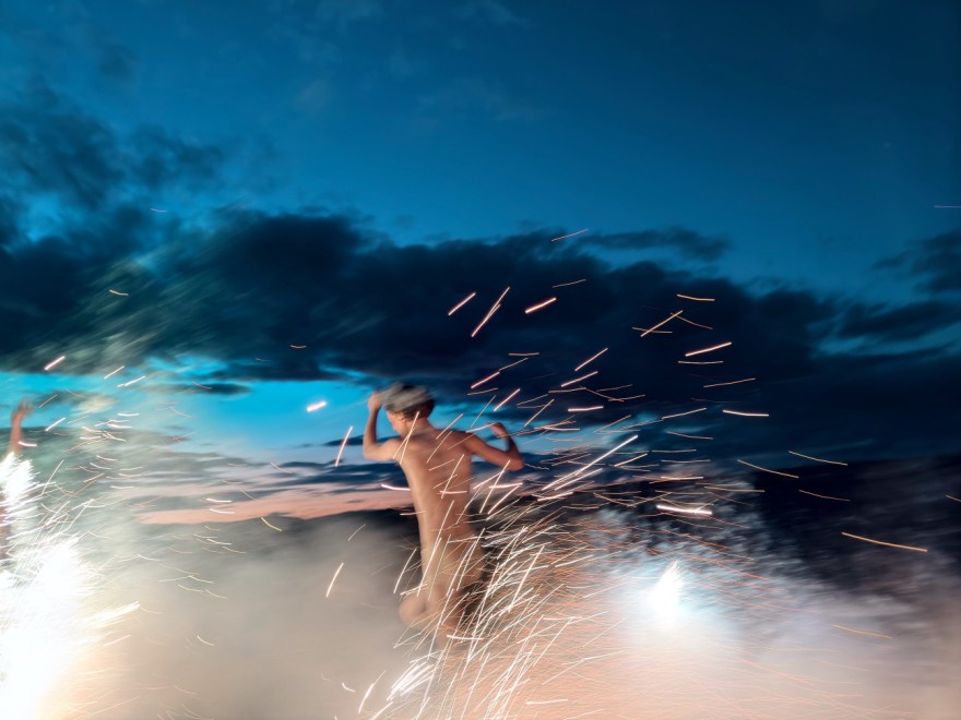
This isn’t the kind of photography I usually write about—mainly because Ryan McGinley’s style feels quite far from my own. Known for his raw, free-spirited portraits of youth and fleeting moments, McGinley is a New York–based photographer who rose to fame in the early 2000s. His work is spontaneous, emotional, and often messy in the most intentional way. That’s not how I usually shoot, but maybe that’s exactly why I find it interesting.
McGinley often works with Polaroids and point-and-shoot cameras, embracing imperfections and rarely editing his photos. That rawness comes through—it’s unfiltered, but never careless. His images feel honest, almost like visual journal entries.
As someone who shoots a lot of film, I appreciate that mindset. I’ve always believed photography is more about seeing than fixing. While editing can polish things, it’s the moment you press the shutter that really matters. McGinley’s work reminds me of that—and also makes me want to loosen up a bit more.
Next time, I think I’ll try shooting more with Polaroid. Not for control, but for the unpredictability—and maybe for a little freedom, too.
中文版本:
这不是我平时会写的摄影类型,主要是因为 Ryan McGinley 的风格和我自己的作品相差挺远。他是一位来自纽约的摄影师,以充满自由感和青春气息的影像而闻名。他的照片常常带着一种不加修饰的情绪,既随性又真诚。这种创作方式不是我惯常的路径,但正因为如此,反而让我觉得格外值得去了解。