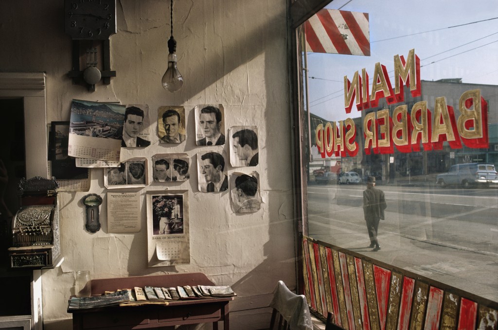
Fred Herzog is an artist I’ve known about for quite a long time, but I never really dug deep into his work. While doing research for a street photography project the other day, I came across his book Modern Color in the library and realized it’s an incredible resource for studying color composition. I ended up buying the book myself because I found it to be an epic when it comes to color street photography.
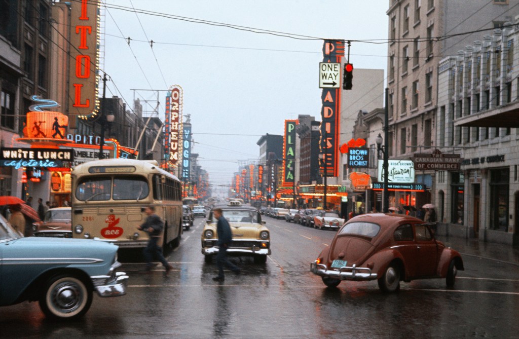
More recently, I saw one of his images featured on an Instagram account, which inspired me to do a more personal research into his work. What I found is that his photographs have a certain kind of magic — a balance between color and composition that feels effortless.
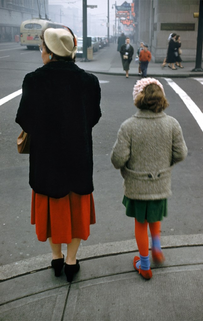
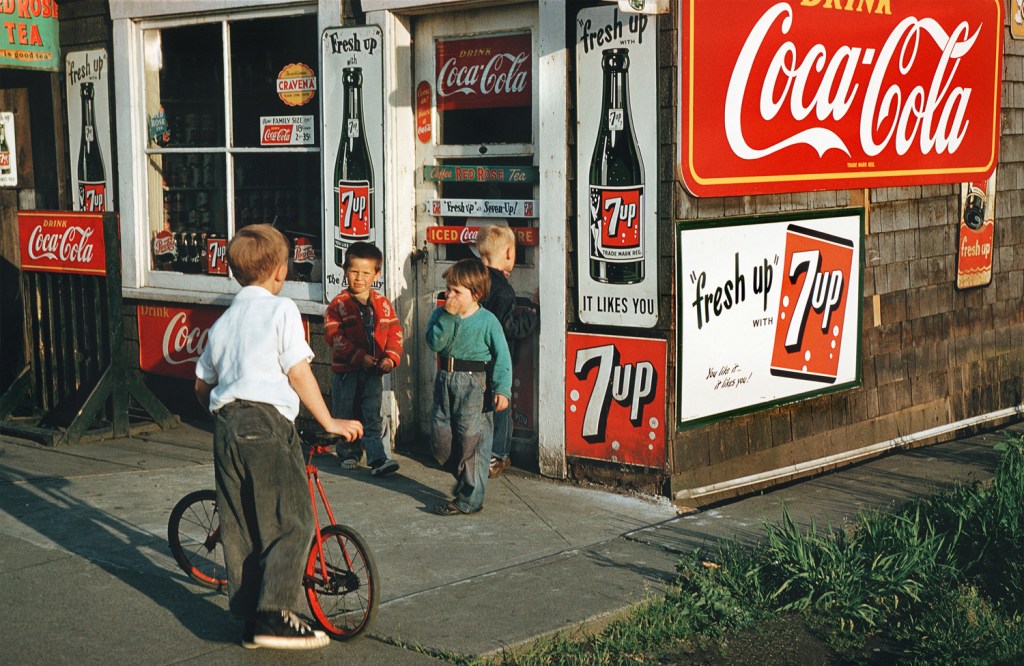
For instance, in one of his images, the composition on its own isn’t particularly strong. But once color comes into play, the whole frame feels balanced — striking a harmony between minimalism and complexity.
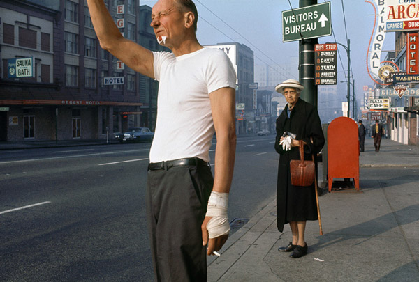
What fascinates me most is how his compositions often break the “rules.” Normally, we would avoid things like a cropped head or a distracting element. But Herzog somehow makes it work — he draws our eyes to unexpected details, like a warped hand, an old lady in shabby clothes, or a red newspaper box in the background. These “imperfections” become the very things that make the image alive and memorable.
中文版本:
Fred Herzog 这位摄影师很早就有所耳闻,,但一直没有真正系统化的了解过他的作品。前段时间在做Street Photography的研究时,在图书馆偶然翻到他的作品《Modern Color》,才意识到这本书在色彩及构图上的水准有多高。以至于后来我自己也买了一本放在家里,可以时不时欣赏1960s-50s街景的同时获取灵感。个人觉得这本书完全可以称得上是彩色街头摄影的经典。
最近,我又在一个 Instagram 账号上刷到他的照片,这让我决定专门花点时间去研究他其他的作品。令人惊讶,他的照片确实有一种平静的力量,在色彩和构图之间达到了看似轻松却非常精准的平衡。
比如,他的一些作品里,如果单看构图其实并不算特别亮眼。但当色彩融入之后,整个画面瞬间就平衡了,既有极简的味道,又带着必要的复杂感。
更进一步,他的构图经常打破所谓的“规则”。通常我们会避免拍到被裁掉的头部或一些分散注意力的元素,但在 Herzog 的照片里,这些反而会成为亮点。他总能神奇地把视线引向那些意想不到的细节,比如一只变形的手、一位衣着破旧的老人,或者背景里的一个红色报刊箱。正是这些所谓的“不完美”,让他的作品变得鲜活且难忘。
